Sdarim
A B2B platform for managing
kollels, including student tracking,
finances, and operations.

Background
Sdarim is a Kollel management platform that became cluttered over time. I redesigned it to be simple, clear,
and user-friendly for its audience.
Research & Process
I mapped the system’s features and flows, then conducted a user survey to uncover key pain points:
lack of clarity, overload, and feeling lost. These findings became the foundation for the redesign.

Target Audience
Key features are hidden or hard to access, date selection is limited, and the phone system is confusing. Better shortcuts could greatly improve usability.
Tasks/Objectives/
Expectations to be Done
-
Check observer reports: late, absent, corrections, etc.
-
Review observer requests and provide responses.
-
Verify reports: payments, summaries, rights & obligations.
-
Add a new observer to the system.
Persona
.png)
Rabbi Yaakov Goldberger
Works at Kollel Shlomo HaTorah
Client's Work Habits
Managers review attendance and payment reports, make corrections, and handle observer requests. Daily use is mostly done by employees with admin accounts.

Frustrations and Pain Points
Users struggle with hidden features and complex tasks like adding fingerprints, approvals, and using the phone system.
Some parts of the system don’t allow selecting date ranges or specific dates, forcing manual entry of each date.
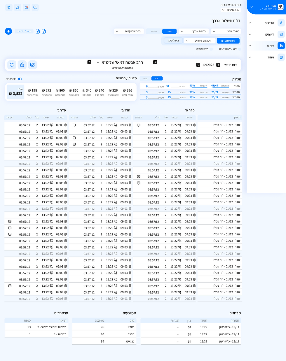
Home Page

To save space, I reduced the size of the graphs and used a toggle to combine the two pie charts into one.

The survey showed avrechim requests are frequent, so I prioritized them on the homepage.
Many useful tools are hidden behind too many clicks; users should be able to create shortcuts for frequent features.
Avrechim List Page

Key actions, like adding fingerprints or building approvals, are buried and require multiple steps.
To improve usability, we added filters that make it easier to locate specific users from the extensive list.
I simplified the top bar by reducing icons and moving one into a labeled dropdown.
Avrechim List - Add New Avrech

I replaced the long form with a four-step popup flow, using clear indicators to show the current step and remaining steps.
Key actions like adding fingerprints or requesting building approvals are buried deep and require many steps.
Each step includes a clear CTA that smoothly guides the user forward in the process.
Avrechim List - Edit New Avrech

Fields are grouped into collapsible sections within each tab to reduce clutter and keep the layout clean.
Editing an Avrech gives full feature access, organized into three tabs for clarity. Each tab shows how many sections it contains.
Phone Extension System Page
The phone system, the most complex screen, was simplified for non-technical users. Keypress (purple) and Extension (orange) trees display details clearly while keeping the structure manageable on one page.

Instead of a "+" icon, the client requested a clear text label to ensure clarity on this complex page.
Each button opens a tree or single extension/keypress based on its position, with a pop-up showing relevant details.
The top row acts as the tree trunk, with each extension leading to subsequent keypresses or extensions, forming the full structure.

As shown, all fields are disabled until an extension or keypress is selected.
User Experience Design
The system was complex, so I simplified it with filters, text buttons, and more white space, added a quick-add for observers, and used a Master-Details layout for salary comparisons.


The Old System Design - Before Redesigning
The color palette is inconsistent, and the screen is overloaded with poorly spaced charts and tables. This lack of structure and hierarchy causes cognitive fatigue and reduces usability.


Flowchart of the New Avrech Addition Process

Visual Language
The company lacks a specific branding language. The design guidelines emphasized a modern and clean look, with maintaining the logo as the only strict requirement.
Assistant Font
אבגד 1234
Colors
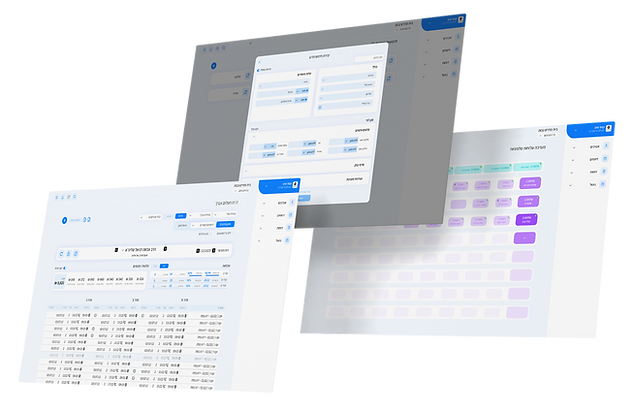
The Final Design of The System
The final design is clean and focused, with a blue-based palette to convey trust. Colors guide actions, creating a clear hierarchy, while typography, spacing, and simplified icons improve readability and make the system intuitive for non-technical users.


What This Project Taught Me
I learned to transform a complex, multi-layered system into a clear, simple interface tailored to a specific audience. I also strengthened my skills in managing complex processes with developers and stakeholders, balancing advanced functionality with optimal UX.